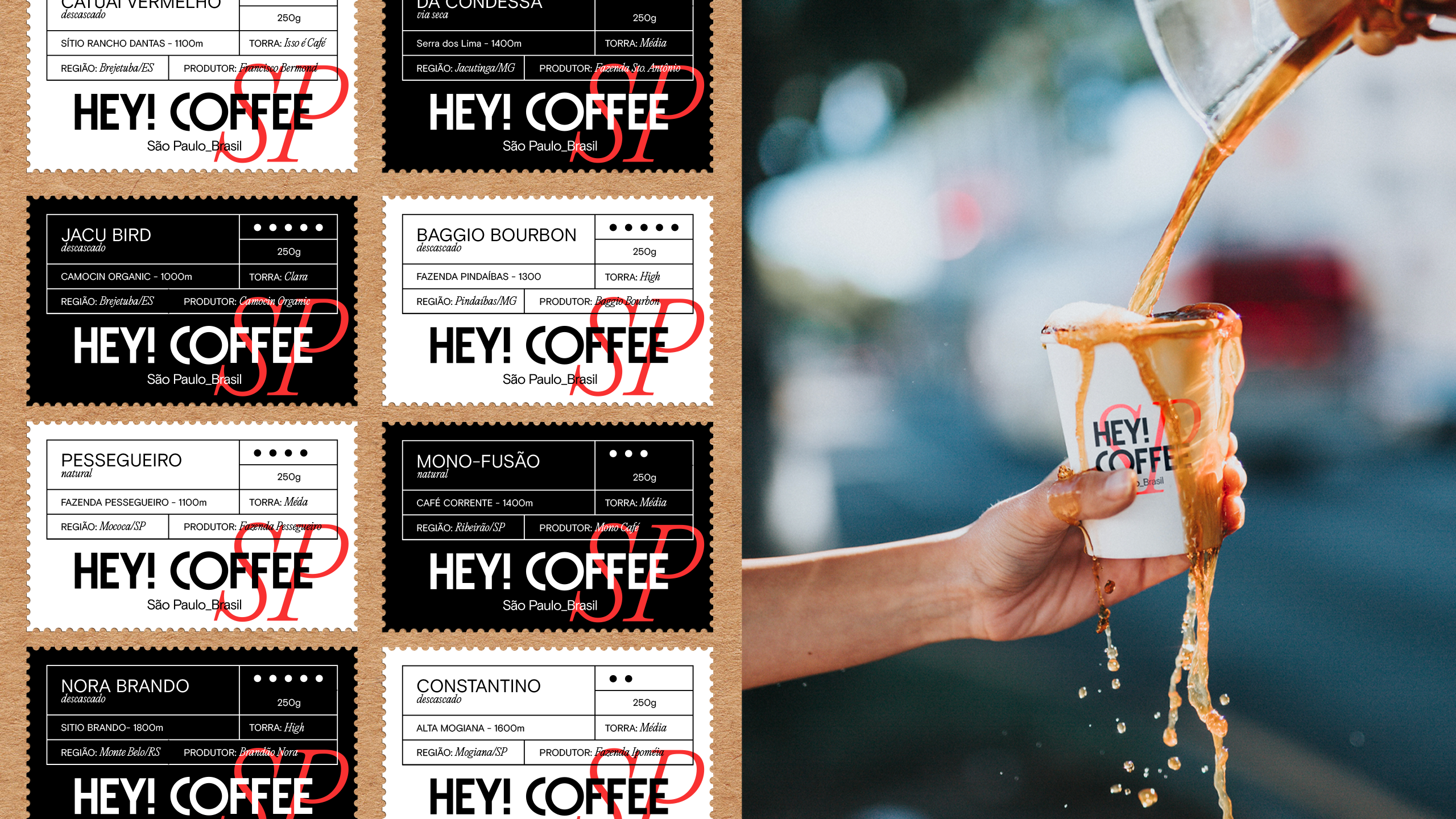
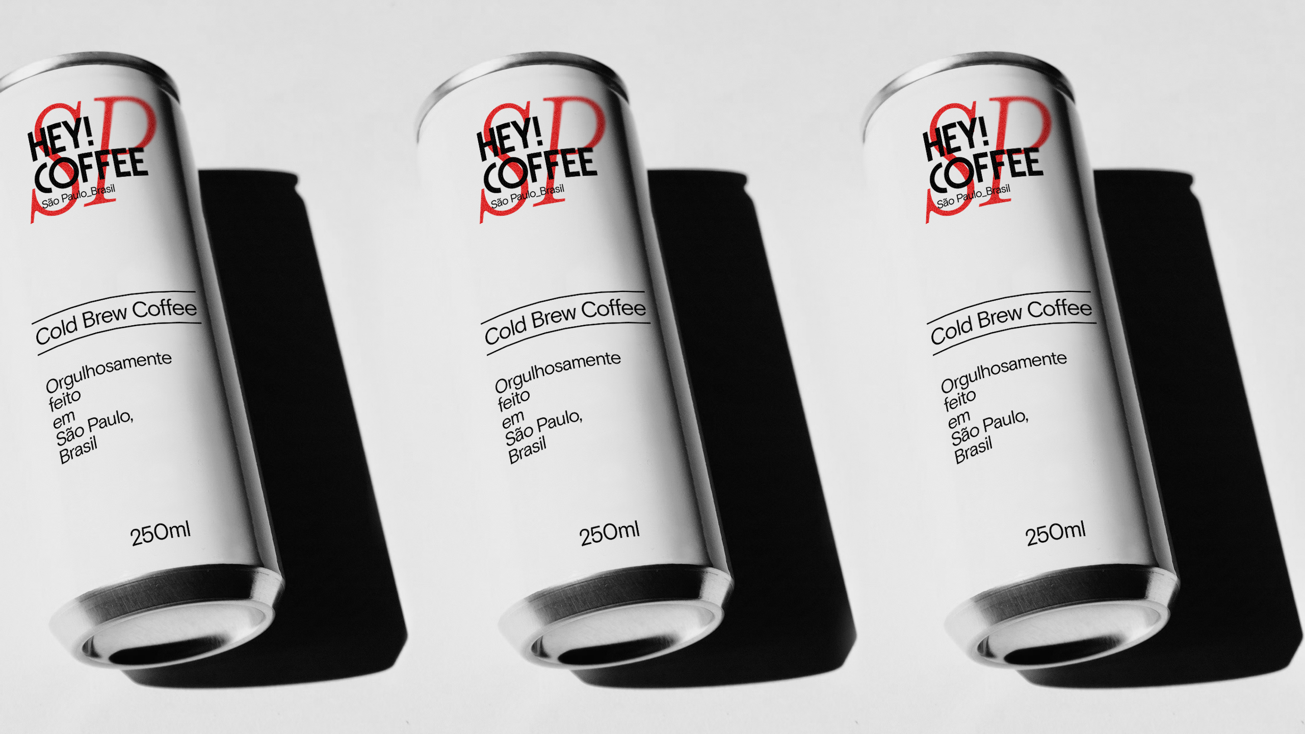
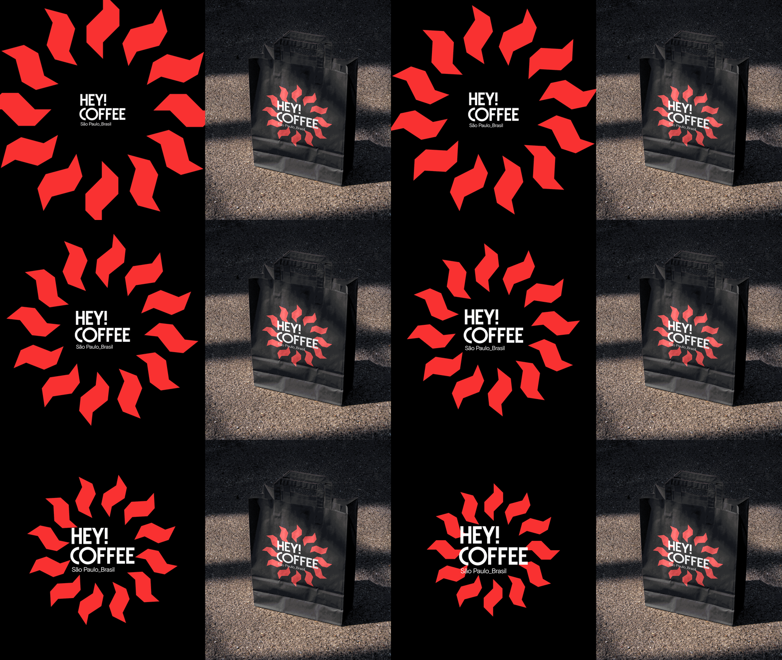
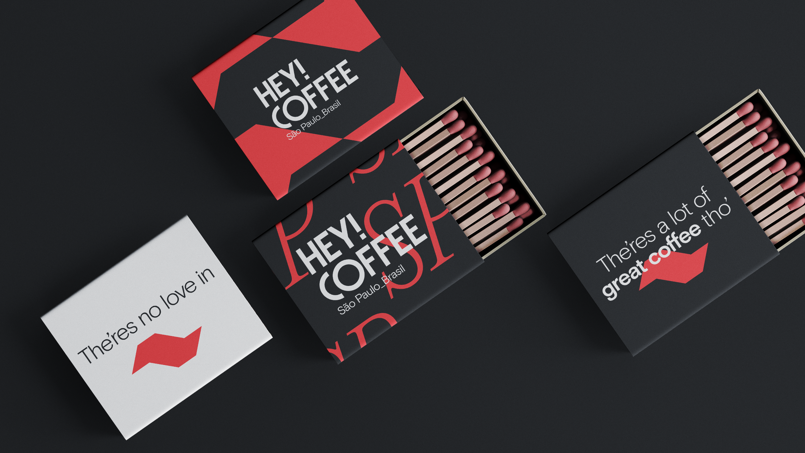
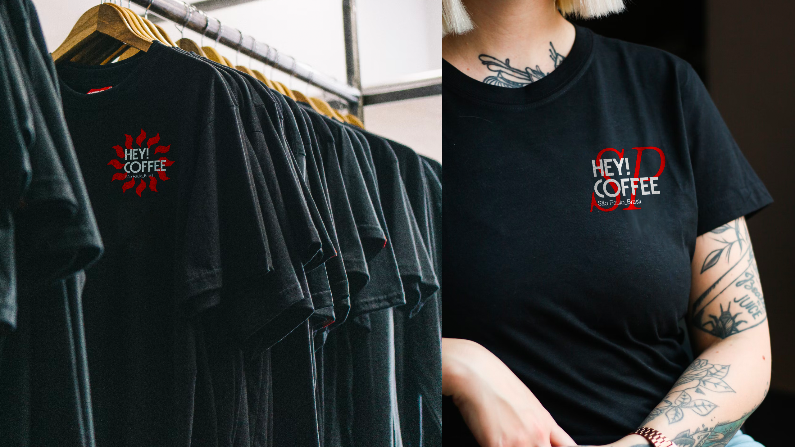
With an immense population, coming from and even greater diverse origin, São Paulo is a melting pot for south american creativity. Hey! Coffee is a great example of a place showcasing this peculiar demographic profile. The owners, originally from Bahia(northeast Brazil), their locals, including us, from all around South America.
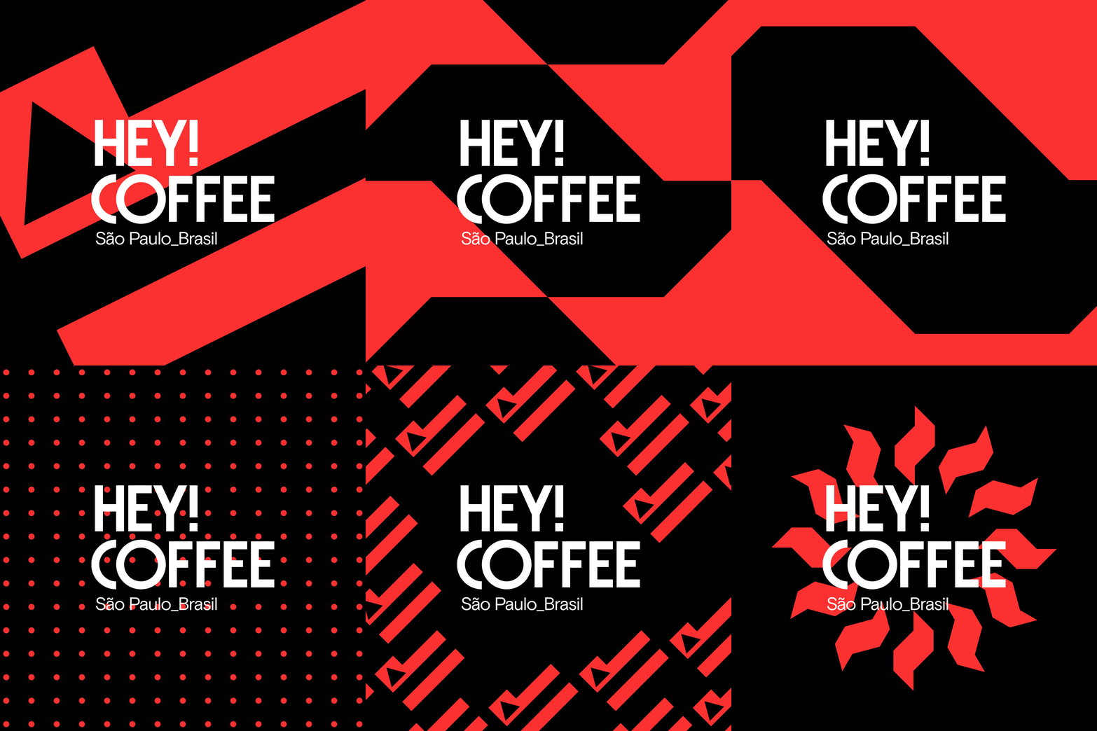
Understanding the coffee shop represents so clearly the place where it’s located, we built a strong, almost brutal, straight to the point identity. Exploring symbols and a chromatic palette that emulates the State’s central branding repertoire. This is true São Paulo down to the last bit.
SERVICES
Visual Identity
Packaging
Art Direction
TEAM
Artur Cunha
Eduardo Brandalise
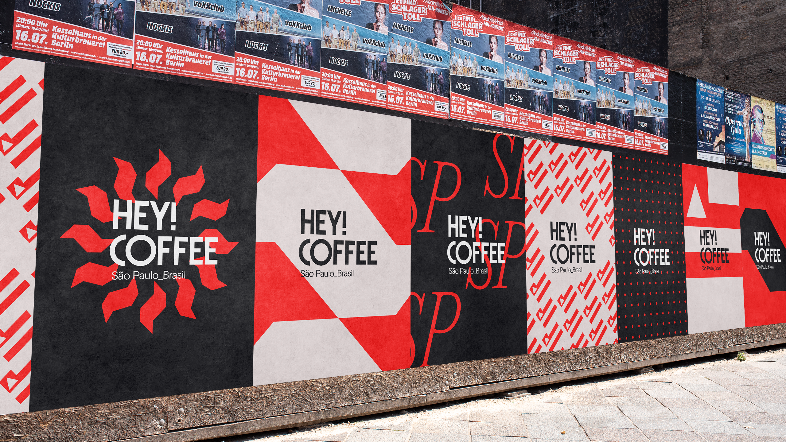
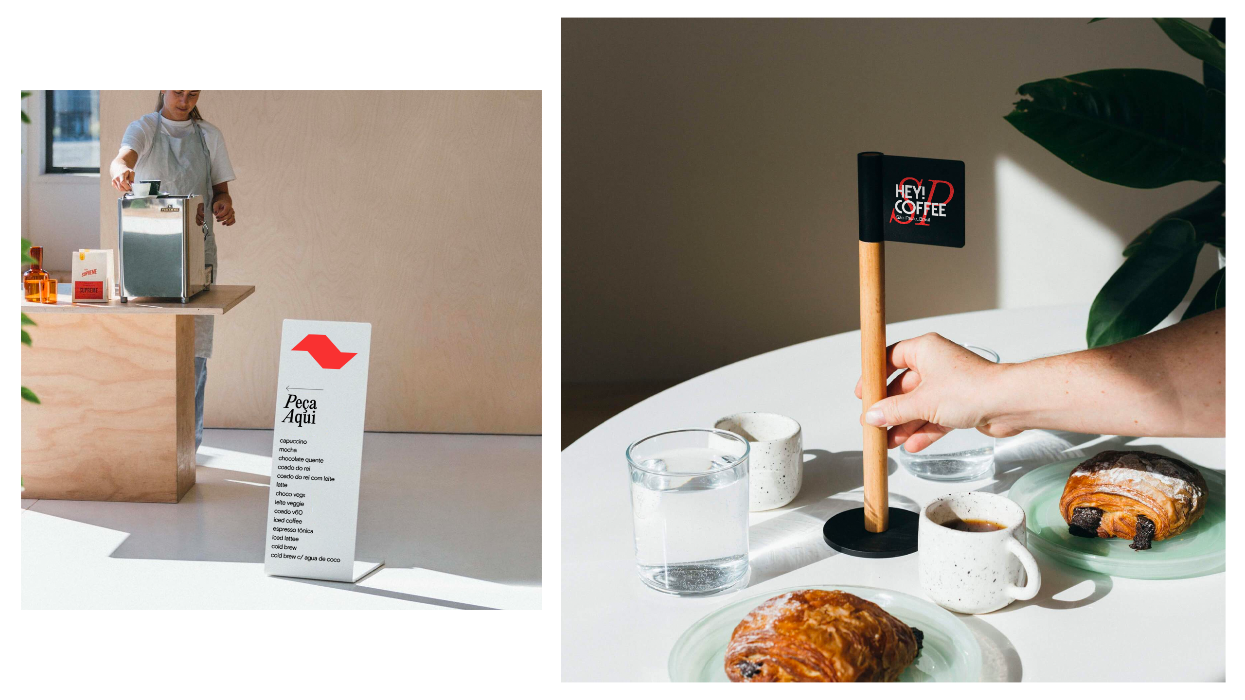
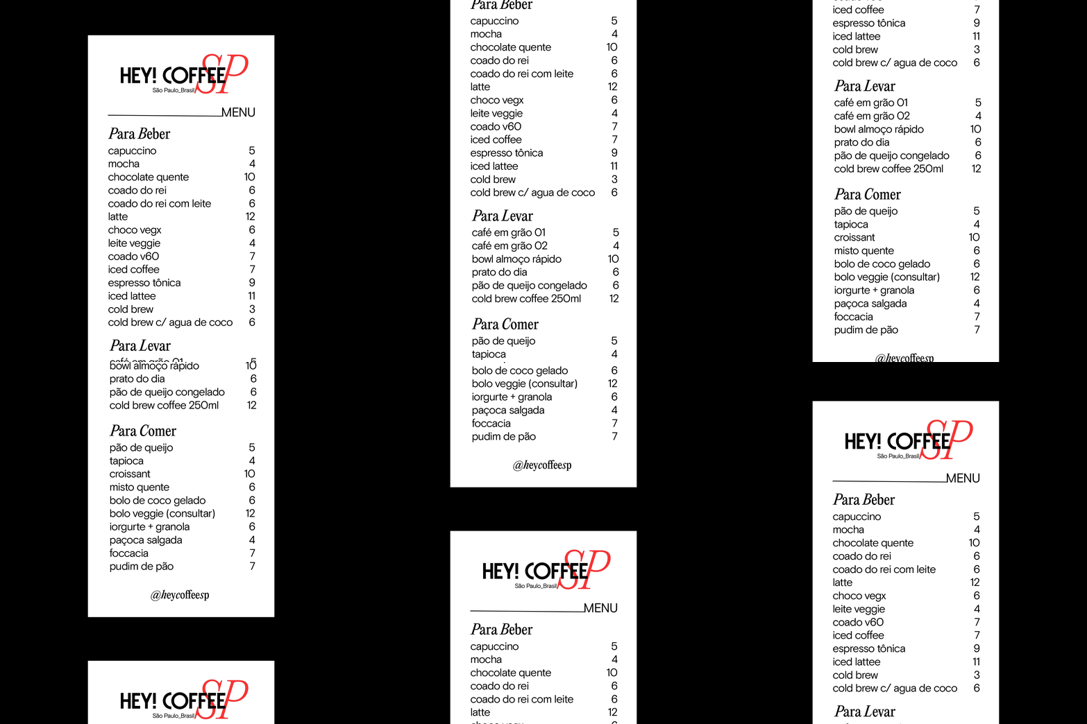
Words on the street claims that the place has “Os Gêmeos” as regulars.
The brand identity is trully self-aware and concise, leaving space for lots of Artistic interpretations around it, as our packaging system showcase.

