Brazil in the last decade went through a wave of new fancy and gourmet-ish burger joints. Against the tide, we built Tio Burgers ‘n Fritas as an Hamburger shop that sticks to the essential: fresh burger, delicious bread, home made mayonese and fries. The aesthetics are inspired by the traditional american snack bars and the verbal narrative plays with the brand’s inherent straightforwardness. Tio Burgers ‘n Fritas was born already a classic.
SERVICES
Strategy
Naming
Visual Identity
Packaging
Illustration
TEAM
Artur Cunha
Eduardo Brandalise
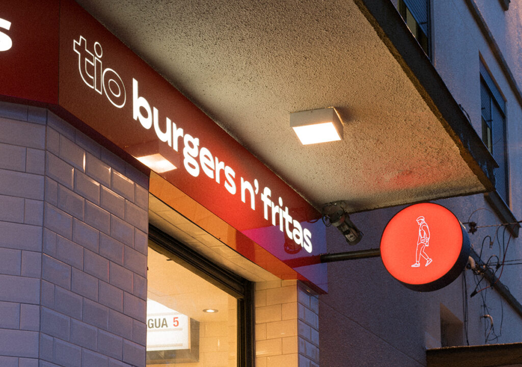
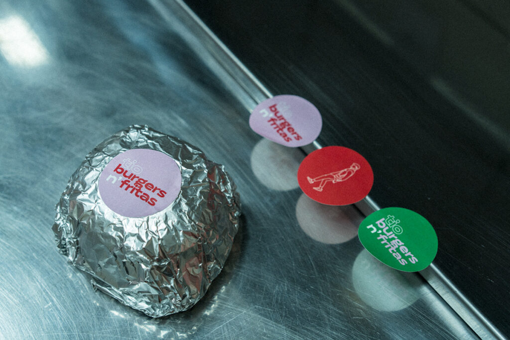
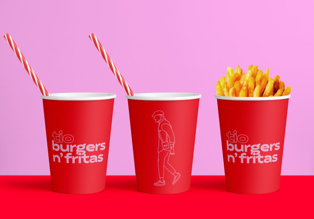
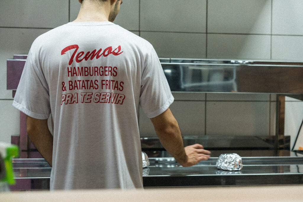
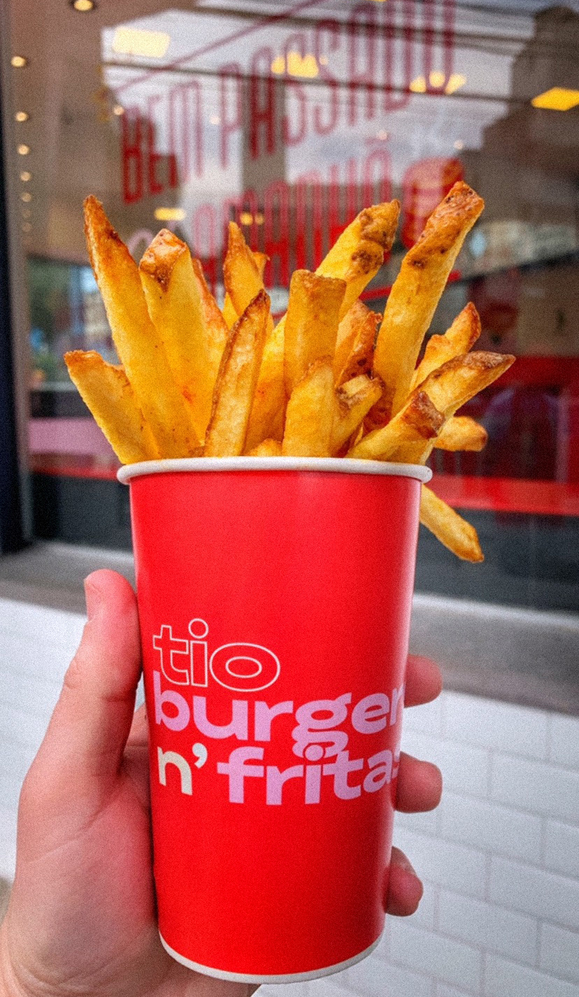

The hand painted window copy shows the sarcastic nature of the brand voice;
WELL DONE, ONLY TOMORROW (TM)
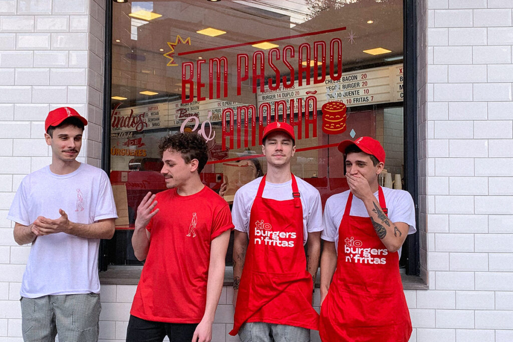

Tio Burgers n’ Fritas has 2 stores. Both of them brings some good old fashioned items as protagonists in the interior design system. The big old lightbox Menu on top of the counter and lots of hand painted branded story-assets in the mirror
Granilite/Terrazo inspired counters and bar tops dialogue with the functional set of tiles, harmonizing the rosé, red and white main colors. It is the good old, almost kitschy american diner vibes with some local tweaks.

